Self-directed concept · UX / UI Case Study · 2025
Designing for the fan who follows wrestlers, not promotions
The problem
Dedicated wrestling fans follow wrestlers across promotions — but every product organises information by promotion and event.
The insight
The data is on the wrong axis — by promotion, when fans think by wrestler — and changes to it aren't trusted.
The turn
Usability testing refuted my core navigation hypothesis — and I caught it before committing to high-fidelity design.
My role
End-to-end UX/UI — framing, strategy, IA, prototyping, test design, running the sessions, synthesis, and iteration.
Project type
Self-directed concept. No shipped product; mock data; five usability participants across two rounds.
Tools
Research & strategy, Mermaid (diagrams), React (interactive prototype), moderated usability testing.
Scope
Multi-stage: reframe → strategy → IA → prototype → two test rounds → handoff.
At a glance
The short version
A wrestler-first concept for tracking pro wrestlers across promotions — and, more than that, a case study in making design decisions under evidence.
- The core move: reframing the brief from "information is scattered" to "the data is organised on the wrong axis, and its changes aren't trusted."
- The spine of the work: design decisions held as testable hypotheses, not assertions.
- The headline result: testing refuted my central navigation hypothesis; I restructured and re-tested before high-fidelity.
- What it shows: judgment under evidence — including being wrong, noticing, and correcting course.
1 · The reframe
Finding the real problem
The brief asked for an aggregator. I pushed on that, because aggregation didn't survive contact with reality. Sites like Cagematch already aggregate cards, results and ratings for almost every promotion. If “scattered information” were the whole problem, it would already be solved.
So I reframed it. What those tools share is that they're all organised by promotion and by event. But a dedicated fan's interest is organised by wrestler — they follow specific people across whatever shows those people turn up on. The information isn't missing; it's filed on the wrong axis. And cards change constantly, and fans get burned when they can't tell what changed or whether to believe it.
Wrestling information is organised by promotion and event, but fans organise their interest by wrestler — so following the people they care about means stitching together scattered, siloed sources whose changes they can't easily trust. HeelFace inverts the axis: wrestler-first, and makes changes trustworthy enough that a fan would rather check here first.
This reframe became the spine of every decision that followed. The work isn't “I designed a wrestling app.” It's “I questioned the obvious framing and found the one that was actually defensible.”
2 · Who it's for
The hardest user on purpose
Dan, 27 — “the multi-promotion follower.” Watches WWE and AEW weekly, follows NJPW and a couple of UK indies, and keeps a mental list of around fifteen wrestlers across all of them. He juggles a stats site, a subreddit, and a handful of social accounts, and second-screens his phone during live shows.
His pain isn't findinginformation — it's that the information is fragmented by promotion while his interest is organised by wrestler, and that he gets burned when an announced match changes or when he's spoiled on a taped show. He'd abandon a new product instantly if its coverage had gaps, because incompleteness destroys the one thing he needs: trust.
I deliberately did not design for the casual viewer. Casual and hardcore fans want opposite things, and serving both tends to produce something too shallow to retain the people who'd actually use it. Choosing the harder, narrower user was itself a strategic decision.
3 · The wrestler-first strategy
Every screen defined by the spine
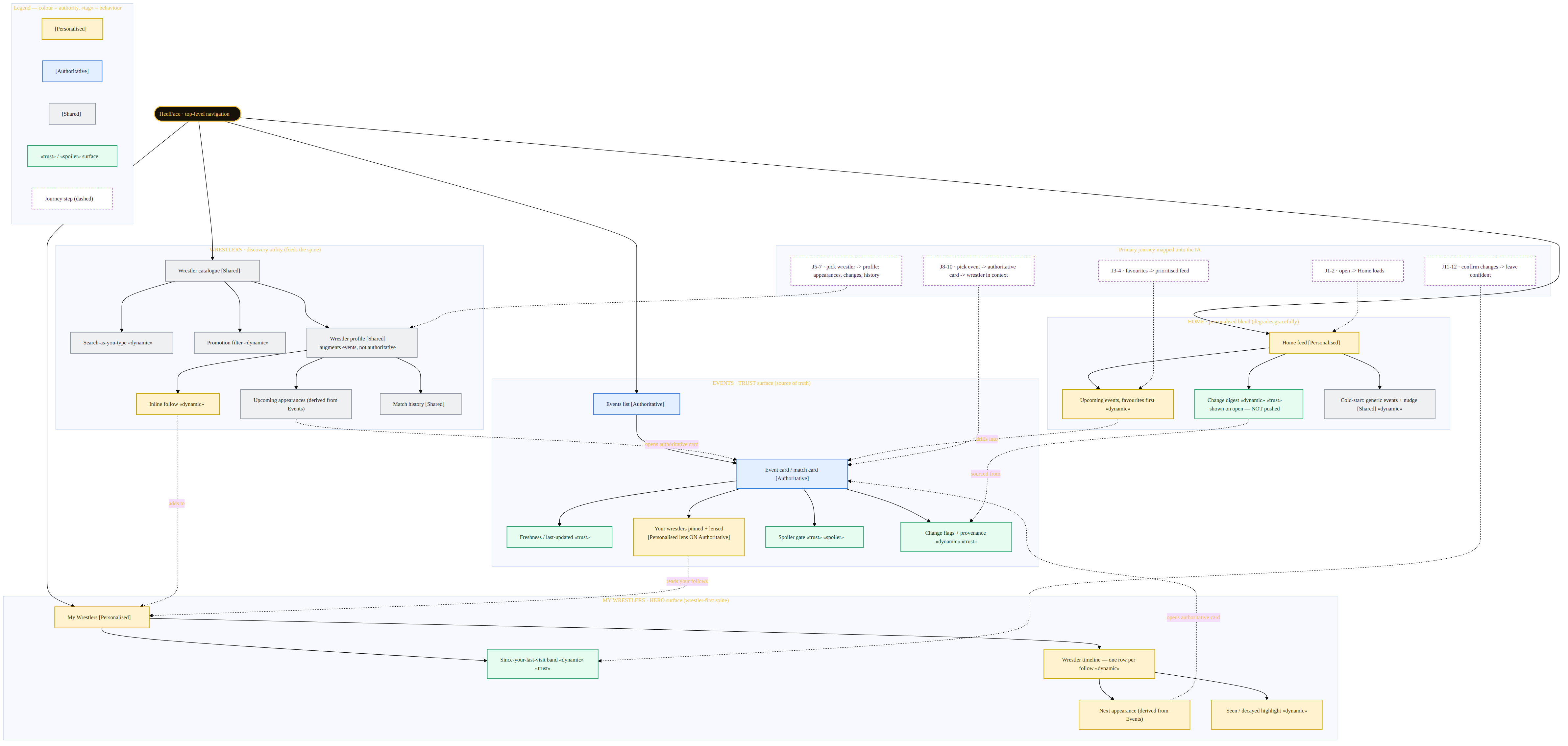
If the unit of the product is the wrestler, every screen needs a defined relationship to that spine. I resolved the structure into four roles:
- My Wrestlers — embodies the spine (data re-organised wrestler-first).
- Events — the authoritative source of truth; personalisation is a lens on top, never a replacement.
- Wrestlers (catalogue) — a discovery utility that feeds the spine; not a destination.
- Home — a blend of the above.
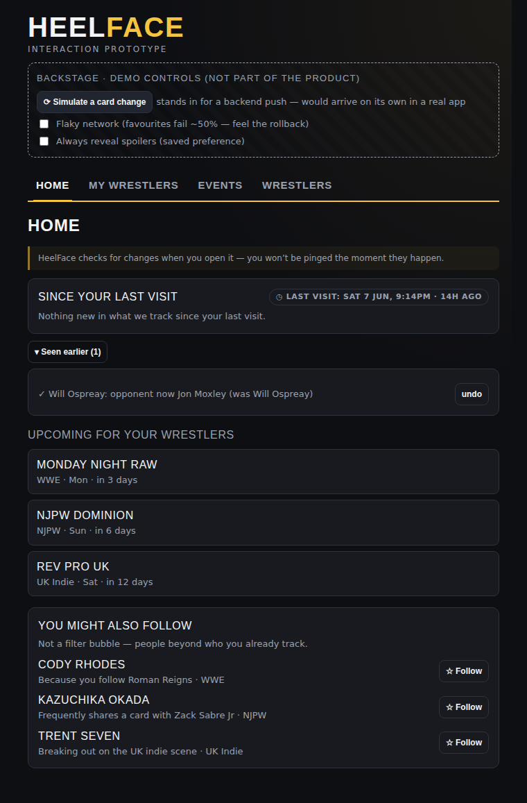
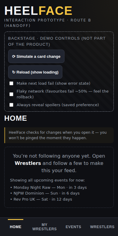
One principle I held throughout: product honesty. With no backend, the prototype could not send real-time alerts — so it must never imply that it does. A permanent line on the feed reads: “HeelFace checks for changes when you open it — you won't be pinged the moment they happen.” Designing the honest limitation in mattered more than a slicker demo.
4 · Information architecture
A decision, not a default
I designed a task-based IA (organised around what Dan is trying to do) and a data-type IA (organised by Wrestlers / Events / Changes / Saved), then argued them against each other rather than defaulting to one.
The data-type version is cleaner and scales more easily — but it organises navigation by exactly the axis the product exists to escape. The task-based IA matches the user's mental model and makes the wrestler-first thesis structural rather than cosmetic.
The more useful move was to refuse the either/or: I kept the data-type structure as the underlying content model and the task-based structure as the navigation — they operate at different layers and aren't in competition.
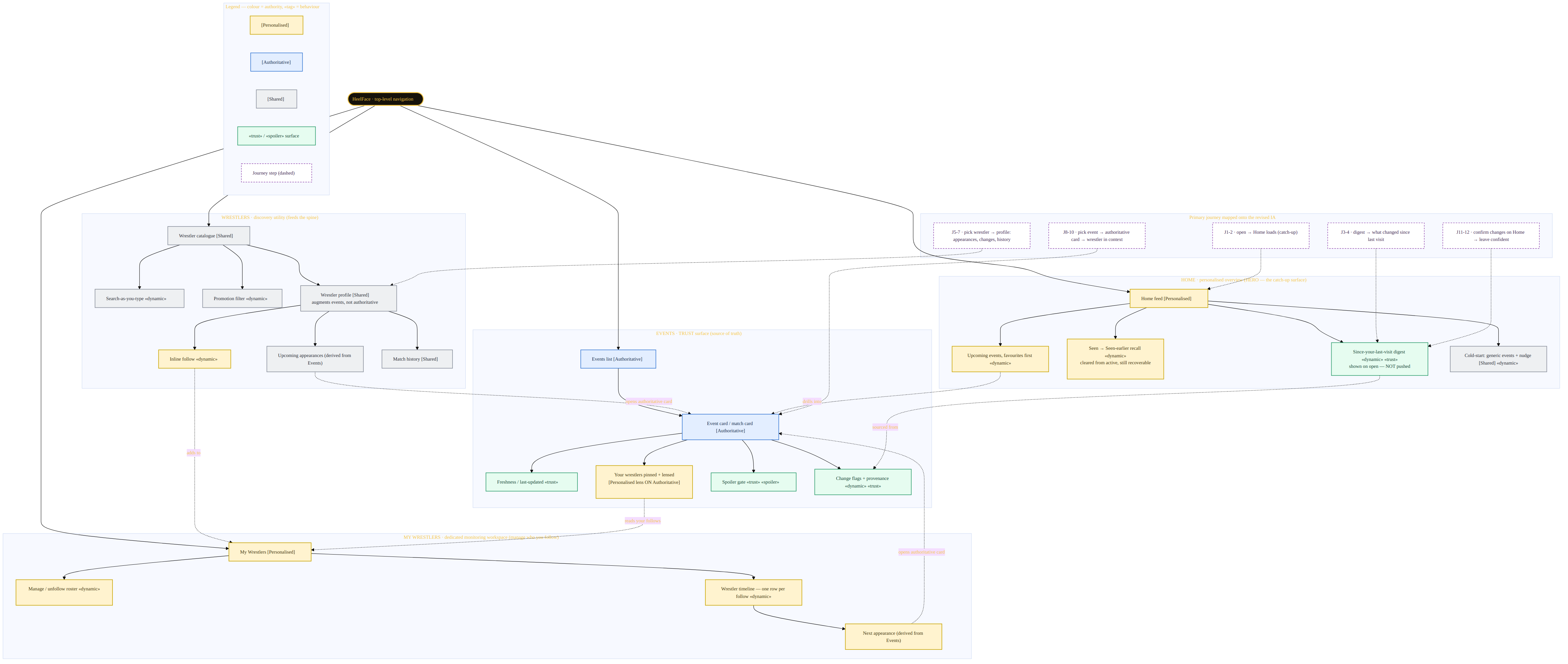
Initial assumption
"My Wrestlers should be the primary personalised destination."
Testing insight
Users needed a broader catch-up surface before entering a deeper tracking workspace.
Final direction
Home became the personalised overview, while My Wrestlers became the dedicated monitoring space.
5 · Dynamic behaviour
Ranked by user value, not by cleverness
I catalogued every moment where the interface should adapt to state — then cut what didn't earn its place. (A “Heel/Face” alignment filter: alignment is kayfabe, flips mid-storyline, and isn't how anyone searches. Cut.)
The moments that stayed all served the two real jobs:
- Change detection — a 'since your last visit' digest, scoped to the wrestlers you follow.
- Provenance — every change shows whether it's confirmed or rumoured, and how many sources back it.
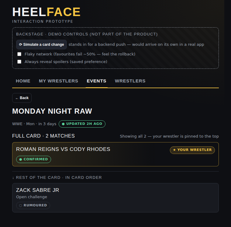
- Lens, not filter — on an event card, your wrestlers are pinned and highlighted, but the full card stays visible.
- Spoiler control — for taped shows, results stay hidden behind a deliberate reveal.
- Optimistic follow — instant state change, with a real rollback path when a save fails.
6 · The prototype
Every decision made clickable
A working React prototype became the project's source of truth — rather than describing the design in Figma and leaving behaviour to imagination.
The HeelFace prototype, running live. Follow a couple of wrestlers, then use the “Backstage” panel to simulate a card change and watch the feed update. Backstage is test scaffolding, not product UI.
7 · Testing
Where I was proven wrong
Rather than test generic “can you find X” tasks, I framed each contested decision as a hypothesis and ran moderated, think-aloud sessions against it — three participants in the first round. The point wasn't to confirm the design; it was to find where it broke.
With three non-fan participants, I treated this as friction-finding — evidence about usability, not proof about wrestling-domain preferences. Even so, two of my hypotheses were refuted.
My central navigation bet was wrong
I had made “My Wrestlers” the hero — the place personalised updates lived. Every participant expected that content on Home, and read “My Wrestlers” as a settings or management area. This was the most valuable thing the test produced.
“I assume Home is where my updates would be.”
“That sounds like where I manage favourites.”
| Hypothesis | Result |
|---|---|
| Users go to "My Wrestlers" for personal updates | Refutedthey went to Home |
| "My Wrestlers" reads as the hero | Refutedread as settings |
| Event card reads as full card, not filtered | Failedfor a participant |
| Seen state reads as recall, not clutter | Failedexpected it cleared |
| Provenance (confirmed/rumoured + sources) is understood | Supported |
| Pull-not-push model is understood | Partialunderstood, but alerts still expected |
Held honestly: three participants surface major friction, not statistical behaviour — so I report these as “observed with three participants,” not as proof about all users.
8 · Iteration
Fixing what the evidence exposed
The evidence pointed deeper than a rename. I restructured to match the mental model the test revealed.
Restructure: Home becomes the feed
People wanted Home to do the job “My Wrestlers” was built for — so I moved the personalised change digest to Home, where people already looked, and recast My Wrestlers as the “manage who you follow” list, which is what participants had assumed it was. The design stopped fighting the mental model and started matching it.
Micro-fix: lens, not filter
The misread happened because the highlighted match floated to the top — which pattern-matches to “filtered result” — while the reassurance sat at the bottom where the misreader never reached. The fix front-loads proof: an explicit match count (“Full card · 3 matches”) and a “Rest of the card” divider that reframes the reorder as structure rather than exclusion. No new colour, no toggle.
Redesign: seen, with recall
“Seen” was a genuine conflict between two needs — “seen = cleared” and “let me look that up again.” The fix separates them: marking a change seen clears it from the active digest, and seen items collect in a collapsed “Seen earlier” group with undo. It's the email-archive pattern, so users arrive already knowing how it works.
9 · Re-validation
Closing the loop
A fix isn't validated until it's re-tested. I ran a second round with two fresh participants and pre-written pass/fail criteria — so I was measuring first-run clarity, not what earlier participants had learned. The specific failures no longer appeared.
“This is exactly where I expected changes.”
“Full card tells me everything is here.”
| Issue | Round 1 | Round 2 (2 participants) |
|---|---|---|
| Where personal updates live | Expected Home, found nothing there | Home is the update destination |
| Event card (lens vs filter) | Read as filtered | Read as the full card |
| Seen / recall | Seen items caused confusion | Cleared, and recoverable |
Held honestly: a clean second round with two non-fans, in a confirmation-framed test, is directional — not proof the design works for everyone. The accurate claim is that the Round 1 failures were no longer observed, not that the design is “validated.”
10 · High fidelity & handoff
Taking it toward production
With the structure holding up across both rounds, I took the prototype toward production rather than re-describing it in a new tool.
- Design system: a dark broadcast aesthetic — condensed display type, a 'title-belt gold' accent reserved for your wrestlers, red for changes and alerts, colour never the sole signal.
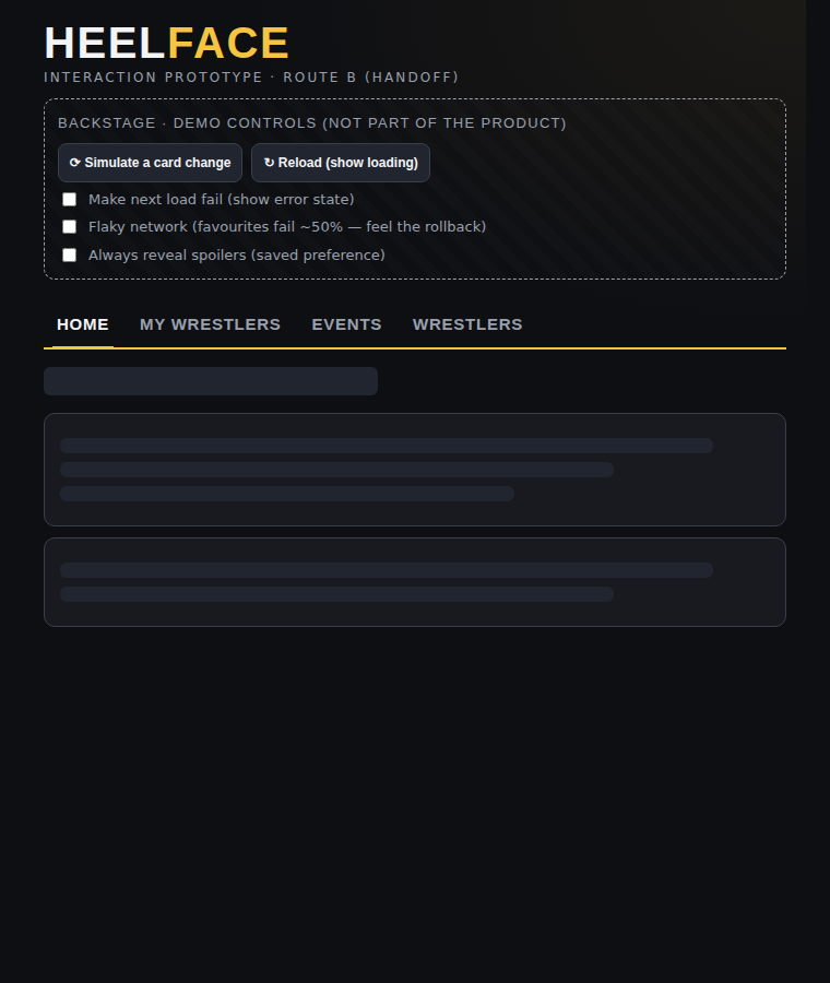
- States: loading skeletons and a load-error / retry state, alongside the empty and edge states.
- Responsive: a bottom tab bar and 44px touch targets on mobile — the real usage context, since fans second-screen on a phone.
- Accessibility: all text/UI contrast checked to WCAG AA; semantic headings; focus moved to screen on navigation; reduced-motion honoured.
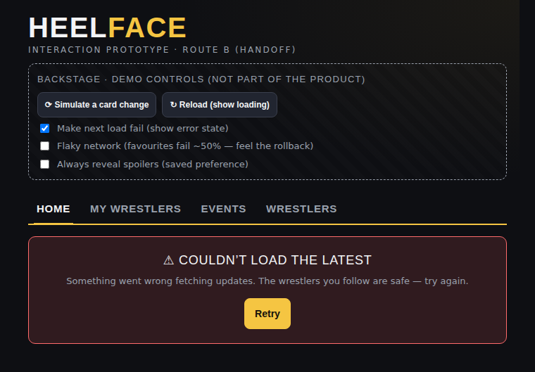
Production-leaning states: mobile bottom-nav, loading skeletons, and a load-error with retry.
11 · What I didn't prove
Naming the edges of the evidence
Naming the edges of the evidence is part of the work, not an apology for it.
- Fan-domain questions are unproven. Spoiler-culture fit, how fans weigh 'rumoured vs confirmed', and full-card vs wrestler-only preference were tested only with non-fans. These need recruited wrestling fans.
- The notification expectation is unresolved. Users understood the pull model but still expected alerts. The honest caption mitigates it; only a real backend resolves it.
- Sample size is small. Five participants across two rounds surface major friction, not statistical behaviour — and I've framed every finding accordingly.
- It's a concept. No shipped product, no real data, no live users. The work is the thinking and the evidence, not a launch.
12 · Reflection
Decision → hypothesis → test → evidence → iteration
The most useful moment in the whole project was a refuted hypothesis, because catching it in a lo-fi prototype cost a restructure — catching it after high-fidelity would have cost far more.
How this was made
This is a self-directed concept project, and I want to be transparent about how it was made. I worked with AI tooling throughout the process — to pressure-test my framing, generate the diagrams and prototype code, draft the test plans, and render screens. The problem definition, the strategic and IA decisions, the choice of what to test, the running of the usability sessions, and the interpretation of what the findings meant were mine. In short: the production was AI-assisted; the design judgment and the decisions are what I'm presenting here.